
THe Meriwether
This fall, I took color theory as a five week workshop as one of my classes. In this class we experimented with the color wheel and use of color in everyday life and in our work. This included mixing paints and creating work using undertones and studying the science of color. Below are three pieces from the class all of which were a different study of colors and techniques.


This study of a Campbell's soup can is monochrome, meaning that it only uses one color. Using only a black value scale it made my focus shift to contrast and light in the painting. Using white for the lightest colors and true black for the darkest parts of the painting. Everything else is black diluted with white, creating different grey’s which all fall on the value scale.


This piece is also monochrome, using red as the singular color. The red scale that was used for this piece goes all the way to black. One thing that was taught in this class is how black is just the darkest shade of a color. The black seen in this is just the darkest shade of red. No black paint was used for this. Instead, I mixed the primary colors to keep the black having the red undertone because if the black does not have a red undertone it will throw off the unity of the painting.
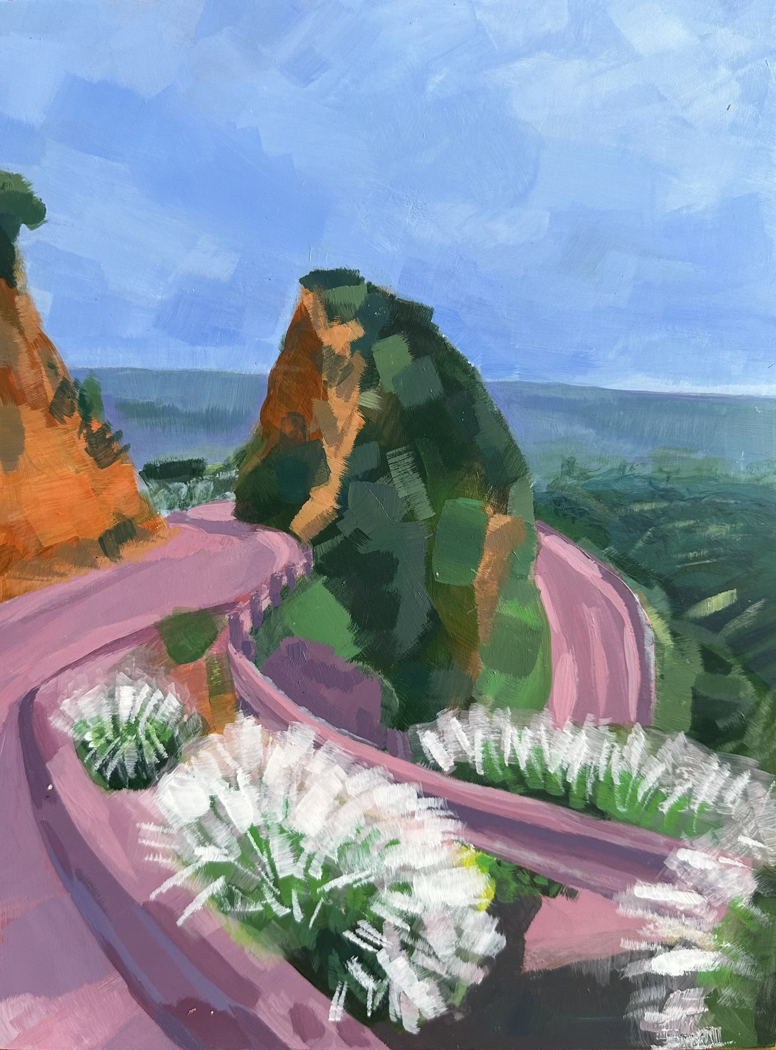
This piece was my final project for the color theory class. I used a square on the color wheel, as seen below, as the palette for this piece. The shade scale can also be seen down below as well. The reference photo was a photograph I took on the road to the Hollywood sign in Los Angeles, California. I used an abstract style for this piece where I focused on use of color instead of exact detail to add a sense of motion to the piece.


Also! My Sketchbook is a new section added to my website. At the end of each month there will be a new “sketchbook” uploaded that shows my more informal pieces from that month. This includes sketchbook pages, class assignments, thumbnails, and other smaller projects as well. Thank you for reading!